The price list becomes the spine of the page
It stops being a buried table and becomes the lead section, in deep green, with monospaced tabular figures so it reads as a public document rather than a sales pitch.
Speculative redesign
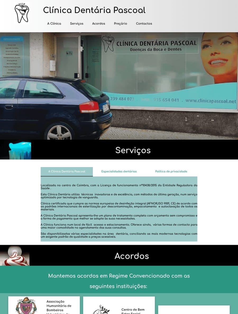
In a city where MALO CLINIC, Smile.up, Santa Madalena and Optidente compete for the same patient, none of them publishes prices. Pascoal publishes the entire price list, and the old site buried it at the bottom of the page. I checked every competitor before committing to this angle.
This is a speculative redesign, made on my own initiative from public information. There was no engagement and the clinic took no part in it. The photography is generated and some figures on the published page are illustrative.
The page itself is in Portuguese. It was written for patients in Portugal and Brazil, and translating it would misrepresent the work.
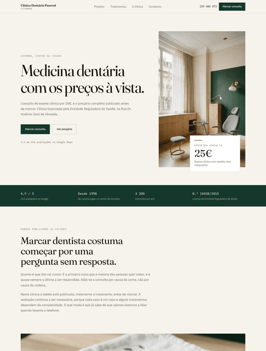
It stops being a buried table and becomes the lead section, in deep green, with monospaced tabular figures so it reads as a public document rather than a sales pitch.
Paper and ink, editorial serif, 2px radius and 1px rules instead of shadows. The opposite of the dental flyer with a stock-photo smile.
Header, hero, end of the price list, final CTA and mobile menu, all pointing to the same action, with the phone number always visible alongside.
Marketing and lead capture site, live.
The clinic's best asset was buried in a bullet point.
Two specialties, one page, no decision made.
From the briefing in a chat to finished PSDs, with two approvals of mine.