The aligner promoted to a full section
It leaves the bullet list and becomes the third section of the page, with the product shot in macro as an object of desire, plus the four steps of treatment.
Speculative redesign
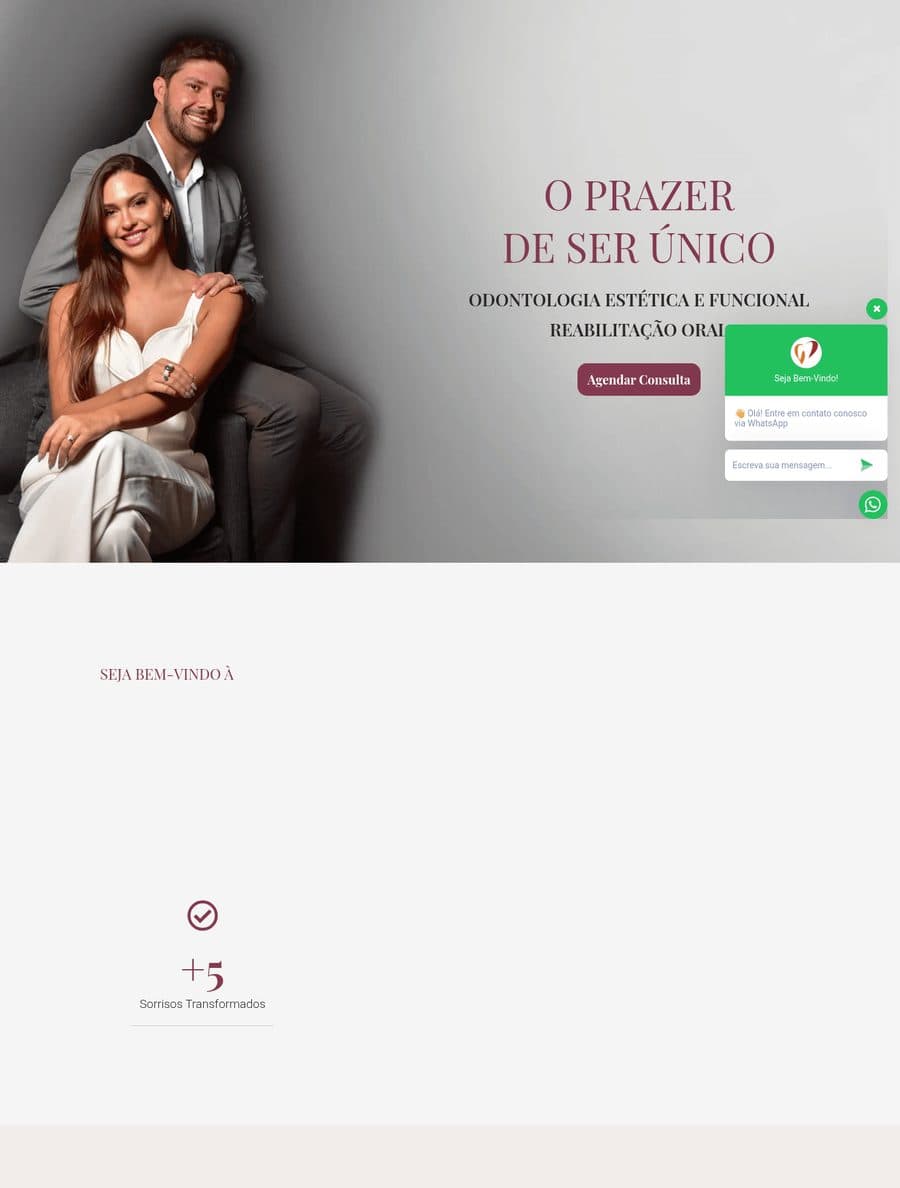
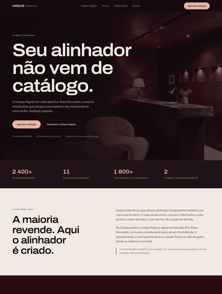
I checked seven competitors in Campinas: all offer clear aligners and all resell someone else's brand. Unique has its own aligner, created by the orthodontist who treats you, with a dedicated unit in Hortolândia. That was sitting as one item in the middle of a list, next to Invisalign.
This is a speculative redesign, made on my own initiative from public information. There was no engagement and the clinic took no part in it. The photography is generated and some figures on the published page are illustrative.
The page itself is in Portuguese. It was written for patients in Portugal and Brazil, and translating it would misrepresent the work.
It leaves the bullet list and becomes the third section of the page, with the product shot in macro as an object of desire, plus the four steps of treatment.
The headline says what only this clinic can say: the aligner does not come from a catalogue. The page also owns the fact that they offer Invisalign too, which turns having their own brand into an extra option rather than a limitation.
Deep burgundy derived from the current brand, blush pulled from the photography itself, expanded grotesque at large scale. Deliberately the opposite of the Pascoal concept, to prove the studio does not run on a single template.
Marketing and lead capture site, live.
The price list as the argument, not as a buried table.
Two specialties, one page, no decision made.
From the briefing in a chat to finished PSDs, with two approvals of mine.